Wednesday, December 15, 2010

End of Project04

Project Description:
After understanding the history of the illuminated letter you will be explore the contemporary counterpart. Create a series (3) of illuminated letters based on the visual language of an artist(s), designer(s), architect(s) of your choosing.

Project Overview:
I very much enjoyed this project. It allowed for absolute freedom. The main reason I enjoyed this project was that I was abale to sketch and utilize many different mediums to try and represent artist I personally look up to. Thinking back over my artists I would have done the exact same ones but would have liked to do another for Jim Henson, I mean come on the muppets in space was great! I may in the future go back and create more drop caps for other artists or even create more for the artists I have studied for this assignment. All in all this was my favorite project of the year.

Saturday, November 20, 2010

shopping list to a new awesome degree.

i may have to start making lists like this every time i go to the grocery store.

Tuesday, November 16, 2010

illuminated

Illuminated Letters
Letters that are decorated. During the middle ages, monks would copy books by hand since the printing press hadn't been invented yet. In the past, books were very valuable as they were hand made. Monks would illustrate the first letter of the first word on a page or at the start of a paragraph. Some of the best examples of illuminated letters are in the 'Book of Kell' which you can view online as well as find in any decent bookstore.
Illuminated letters may have vines drawn around the letter's parts or a letter may be made to look like something else to make it very ornate. Some of these letters had miniature pictures of angels, peasants working in the fields, angels, gargoyles - all sorts of illustrations and depictions. They are often gilded with gold ink.
catz
Drop cap
In desktop publishing, the first letter of a paragraph that is enlarged to "drop" down two or more lines, as in the next paragraph. Drop caps are often seen at the beginning of novels, where the top of the first letter of the first word lines up with the top of the first sentence and drops down to the four or fifth sentence.
to the beginning of a section

artists i has like 4

Leonardo da Vinci, Gustave Courbet, Tim Burton, Bill Watterson, Tex Avery, Jim Henson, and Claude Monet.

My favorite four may have to be...

Tim Burton: An Academy Award and Golden Globe-nominated American film director, producer, writer and artist, Tim Burton is famous for dark, quirky-themed movies. His is known for films such as Beetlejuice, Edward Scissorhands, The Nightmare Before Christmas, Sleepy Hollow, Corpse Bride and Sweeney Todd: The Demon Barber of Fleet Street, and for blockbusters such as Pee-wee's Big Adventure, Batman, Batman Returns, Planet of the Apes, Charlie and the Chocolate Factory and Alice in Wonderland, his most recent film, that is currently the second highest-grossing film of 2010 as well as the sixth highest-grossing film of all time.


Jim Henson: creator of The Muppets


Bill Watterson: American cartoonist and the author, Bill Watterson created the influential and admired comic strip Calvin and Hobbes. His career as a cartoonist ran from 1985 to 1995. Unfortunately, he stopped drawing Calvin and Hobbes at the end of 1995 with a short statement to newspaper editors and his fans. Watterson felt he had achieved all he could in the comic strip medium.  

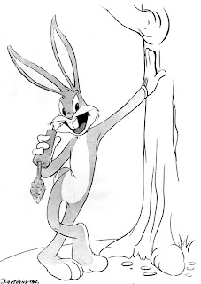
Tex Avery: American animator, cartoonist, voice actor and director, Tex Avery is famous for producing animated cartoons during The Golden Age of Hollywood animation. He did his most significant work for the Warner Bros. and Metro-Goldwyn-Mayer studios, generating the characters of Daffy Duck, Bugs Bunny, Droopy, Screwy Squirrel, Porky Pig and Chilly Willy into the personas for which they are remembered. Avery's influence can be seen in almost all of the animated cartoon series by various studios in the 1940s and 1950s. Avery's style of directing encouraged animators to stretch the boundaries of the medium to do things in a cartoon that could not be done in the world of live-action film. An often-quoted line about Avery's cartoons was, "In a cartoon you can do anything."  


Saturday, November 6, 2010

a ride to and from

heres my rough copy of my image making project i have been working on, hope you enjoy...

Sunday, October 31, 2010

bored to death=hilarious

i started watching this show on hbo. i found it quite funny, and the intro is quite neat.

Monday, October 11, 2010

PLZ VOTE!1!!


CAN i HAZ evry1 plz vote! i needs mor numberz THX!1111!!!

Friday, October 8, 2010

POlls


hai peeplz, i postd sUm noo polz on mi blog, if u culd peaz answr, thx!1!!1

Monday, October 4, 2010

TYPE01 PRJCT01

Here's a look at some of my stuff.
http://www.behance.net/gallery/weather-for-lawrence-ks/734881

Sunday, October 3, 2010

work cited

Blackwell, Lewis, and Lewis Blackwell. 20th-century Type. New Haven, CT: Yale UP, 2004. Print.

"FF Scala Sans." Wikipedia, the Free Encyclopedia. Web. 01 Oct. 2010. .

Hill, Will, and Christopher Perfect. The Complete Typographer: a Manual for Designing with Type. Upper Saddle River, NJ: Person Prentice Hall, 2005. Print.

Majoor, Martin. "FF Scala | FontFont Focus." Martin Majoor Type Design. Web. 01 Oct. 2010. .

FF Scala Sans

FF Scala Sans is a humanist sans-serif typeface designed in by Dutch designer Martin Majoor in 1993. FF Scala was FontShop’s first serious textface, now it is one of its bestselling fonts. Since its release in 1991 it has been used quite widely throughout the world. To mention just a few examples: KLM Royal Dutch Airlines, The Museum of Contemporary Art in Chicago, Los Angeles Mertro, Taschen Verlag, Treaty of Lisbon 2007, Lexus Cars, JBL Sound Systems, Chicago Manual of Style, Bodies - The Exhibition. FF Scala is named after the Teatro alla Scala (1776–78) in Milan. There were two reasons for this name: FF Scala was made especially for a concert hall, the Vredenburg in Utrecht, and the design has it roots in around the time Teatro alla Scala was built, the mid-eighteenth century. Furthermore the word ‘scala’ has the meaning ‘a whole range’, which FF Scala certainly is: from a to z and from serif to sans serif, from light to black and from formal to decorated. As first released (1991) FF Scala had only four styles: regular, italic, bold and small caps. Since then FF Scala has grown to 28 styles. FF Scala and FF Scala Sans are two different typefaces sharing a common form principle. The character of a seriffed typeface mainly arises from the form principle and from elements such as serifs and contrast of the strokes. A sans serif design depends almost entirely on the form principle. FF Scala Sans was made simply by cutting the serifs off from the characters of Scala and by adjusting their contrast. So the skeletons of both FF Scala and FF Scala Sans are identical. FF Scala Sans is directly based on FF Scala, simply by cutting off the serifs and by lowering the contrast. Using black marker and white paint is all it takes to create a sans serif typeface from a seriffed one.
The first attempt to make a sans serif to accompany a serif design was made in 1931 by the Dutch typographer Jan van Krimpen with his typeface Romulus. Four weights of ‘Romulus Sans’ were cut, but unfortunately they were never released. In 1995 Emily King analyzed the serif-sans connection as follws: “The design of sans serif faces which have their roots in seriffed form has been a theme of type design since the late 1980s, with several faces including Dutch designer Martin Majoor’s Scala Sans and his compatriot Luc(as) de Groot’s Thesisfalling into this category. That this kind of type design has recently become a preoccupation might be seen as the outcome of a broadly post-modern belief that it is possible to reconcile apparently incompatible historical chapters into a positive whole.”
Since FF Scala Sans is based on FF Scala it is indirectly based on the vertically stressed old-face model. This is rarely seen with sans serif designs (Gill Sans [1929] and Syntax [1968] are notable exceptions). Many of the modern sans serifs (Akzidenz Grotesk, Helvetica, Univers) are based on eighteenth-century classical designs such as Walbaum. Their basic forms are rather ‘closed’ while the same elements in FF Scala Sans are ‘open’. This improves its legibility, especially in smaller point sizes.
Also the italic of FF Scala Sans is based on the seriffed form: so it is a real italic, not a sloped roman. This means not only that its slope is different to that of the roman, but that its form principle is clearly different too, unlike in most sans serifs today.
Majoor’s font face is a sans serif. Sans serif typeface is one that does not have the small features called "serifs" at the end of strokes. The term comes from the Latin word "sine", via the French word sans, meaning "without".
In print, sans-serif fonts are more typically used for headlines than for body text.[1] The conventional wisdom holds that serifs help guide the eye along the lines in large blocks of text. Sans serifs, however, have acquired considerable acceptance for body text in Europe. FF Scala Sans is also considered a humanist sans serif. This category contains typefaces in the humanist sans-serif classification. They first appeared in the early twentieth century. Humanist sans-serif typefaces are characterized by the presence of the hand, an uppercase similar in proportion to the monumental Roman capitals, a lowercase similar in form to the Carolingian script, and an overall more organic structure. Humanist sans-serif typefaces frequently have a true italic rather than a sloped roman. This is most often seen in a single-story lowercase italic a.
To add different condensed versions to sans serif designs is much more common than it is with seriffed typefaces. FF Scala Sans comes with a Regular Condensed and a Bold Condensed. FF Scala Sans Regular Condensed is perfect for use in captions or as a text face in narrow newspaper columns. Of course it can also be used for headings. FF Scala Sans Bold Condensed is both a display face and a text face. Scala is a Text face that functions well under conditions of low resolution. The regular weight is fairly even color, with a restrained contrast providing a dramatic comparison to the greater contrasts of the bold weight. In the both FF Scala and FF Scala Sans non-lining or old style figures are, as a matter of policy, provided in the standard character set and in the Caps set. The special Lining Figures fonts (LF fonts) provide the lining figures.
The Caps sets have some special features. The normal capitals are included in the Caps set, so for example when typing a name in small caps with starting capitals, one does not have to change the font. Some characters in the Caps set ( & ? ! ¿ ¡ ) are specially designed to match the size of the small caps.
The italic small caps are again real italics, which can be seen clearly in some characters.
The common f-ligatures ( fi fl ff ffi ffl ) are added in a special Expert set. There is even an fj-ligature.

Tuesday, September 28, 2010

classy fonts

old style - considered friendly, it is based on traditional calligraphy. typefaces are low contrast with a diagonal stress. scooped serifs, sturdy without being heavy
*Bembo, Caslon, Garamond, Jenson, Palatino

transitional- transition between renaissance old style and modern typefaces. more contrast between thick and thin strokes. tall x-height
*Baskerville, Caslon, Perpetua

modern - very exact and mathematical. no horizontal emphasis. hairline serifs
*Bodoni, Bauer Bodoni, Walbaum

slab serif - mono weight, used for ads in the early 1800's. geometric machine like impact. uniform serifs
*Serifa, Rockwell, Memphis Clarendon, New Century Schoolbook

sans serif - does not have serifs at the ends of the letters. divided into three groups: grotesque, geometric, and humanistic.
*Futura, Foilio, Frutiger, Franklin Gothic

script - based on a fluid handwritten stroke. similar to cursive
*Brush Script, Casual Script, English Roundhand, Handwritting, Rationalized Script

blackletter - an elegant solution to a tricky design problem: parchment was precious and economy of space was vital, but the text also had to have sufficient oomph to hold its own against the spectacular illustrations surrounding it
*Fraktur, Old English, Rotunda, Schwabacher, Textura

grunge - use special effects to create a texture upon the typeface.
*Almanach, Stencil, Graffiti, 3 The Hard Way Overrun

monospaced - the same width, used when exact and consistent spacing is needed
*Typewriter, Arete Mono, Arial, Chainprinter, Chunkfeeder

undeclared - a mixture of all sorts
*Gotham, Fixedsys, Cooper Black, Optima, Copperplate Gothic


Scala Sans
-sans serif
-designed by the Dutch typographer Martin Majoor beginning around 1990
-humanist
-roman, italics, small caps

Sunday, September 26, 2010

rickrollling

thought this was quite funny and clever.

http://www.stumbleupon.com/su/2IG1Xh/topcultured.com/wp-content/uploads/2010/06/rickroll5.gif

Tuesday, September 7, 2010

typefacer, adrian frutiger

Born the son of a weaver in Switzerland, Adrian Frutiger designed the easy to read typeface we know as Univers. He started out with a strong intrest in sculpture but was pressed by his elders to take a look into the print world. At sixteen he had apprenticed for four years. He then went on to study sculpture, graphic design, and illustration at the Zurick Kunstgewerbeschule. Soon after he began work at Deberny&Peignot. Later he established a design studio in Paris. There he became a freelance typographer, where he designed typefaces, logos, and numerous corporate images. His main goal was to create a very legible form of type. This form was to be translated efficiently. In 1957 he designed Univers, a typeface that was to be neutral and universal(hints the name). Today, Univers is one of the most standard typefaces used. When 1969 rolled around, Adrian designed another typeface, Frutiger. This time it was for the signage system for Charles de Gaulle Airport. Frutiger as a typeface was to be rapidly recognizable and readable. Nowadays the same typeface is used on all motorway signs in Switzerland and France. Adrian, in 1978, published a book on the standard works on typography. Since the year 1992, Adrian Frutiger has been living in Switzerland and is still alive today.

Univers
Unique because it was the first to categorized by numbers.
The grid system used is to show the variations in comparison to each other. This includes various widths, heights, and positions

Sunday, August 29, 2010

measuring variation

weight: overall thickness of the stroke, in relation to their height
width: how wide the letterform in a typeface are in relation to their height
style: divided into serif and sans serif, it also refers to the typeface's history
today we measure type from top of the ascender to the bottom of the descender
point: size of the type with units 0.35mm (pts)
pica: 6 picas to an inch (p)
36pts=1/2 in, 12pts=1p
x-height: the distance between the baseline and the mean line in a typeface
cap height: the height of a capital letter above the baseline for a particular typeface
leading: refers to the amount of added vertical spacing between lines of type

Thursday, August 26, 2010

Tuesday, August 24, 2010

defining definitions.

grid: regularly spaced horizontal and vertical lines
  • the use of a grid allows for an organized way of displaying a designer's ideas. it is an easy way to read concept; good for compare/contrast
modular grid: a grid with four rows and four columns
margins: the negative space between the format edge and the page contents
module: an individual component that can placed with others
flow-lines: alignments that break the space into horizontal bands
gutter: blank space between columns
hierarchy: a way to level the information portrayed in importance, this makes it easier for the viewer to navigate through.
  • by grouping like materials and placing them in a visually pleasing alignment, one can create an excellent sense of hierarchy. to do this one can shift the image or create a much more significate size contrast.
typographic color: something different. a change in the rhythm, value, texture and weight of text that makes it either recede or be drawn forward to the eye and can sometimes dramatically change the hierarchy of the text.